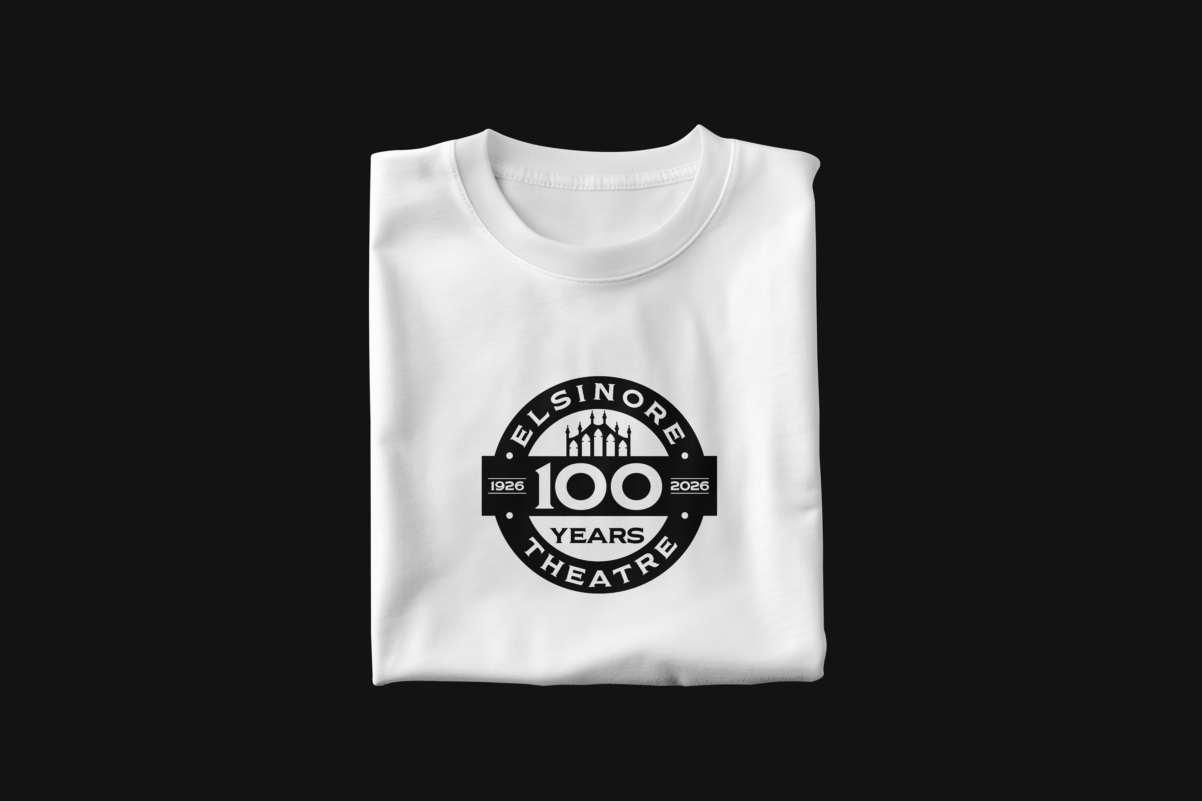

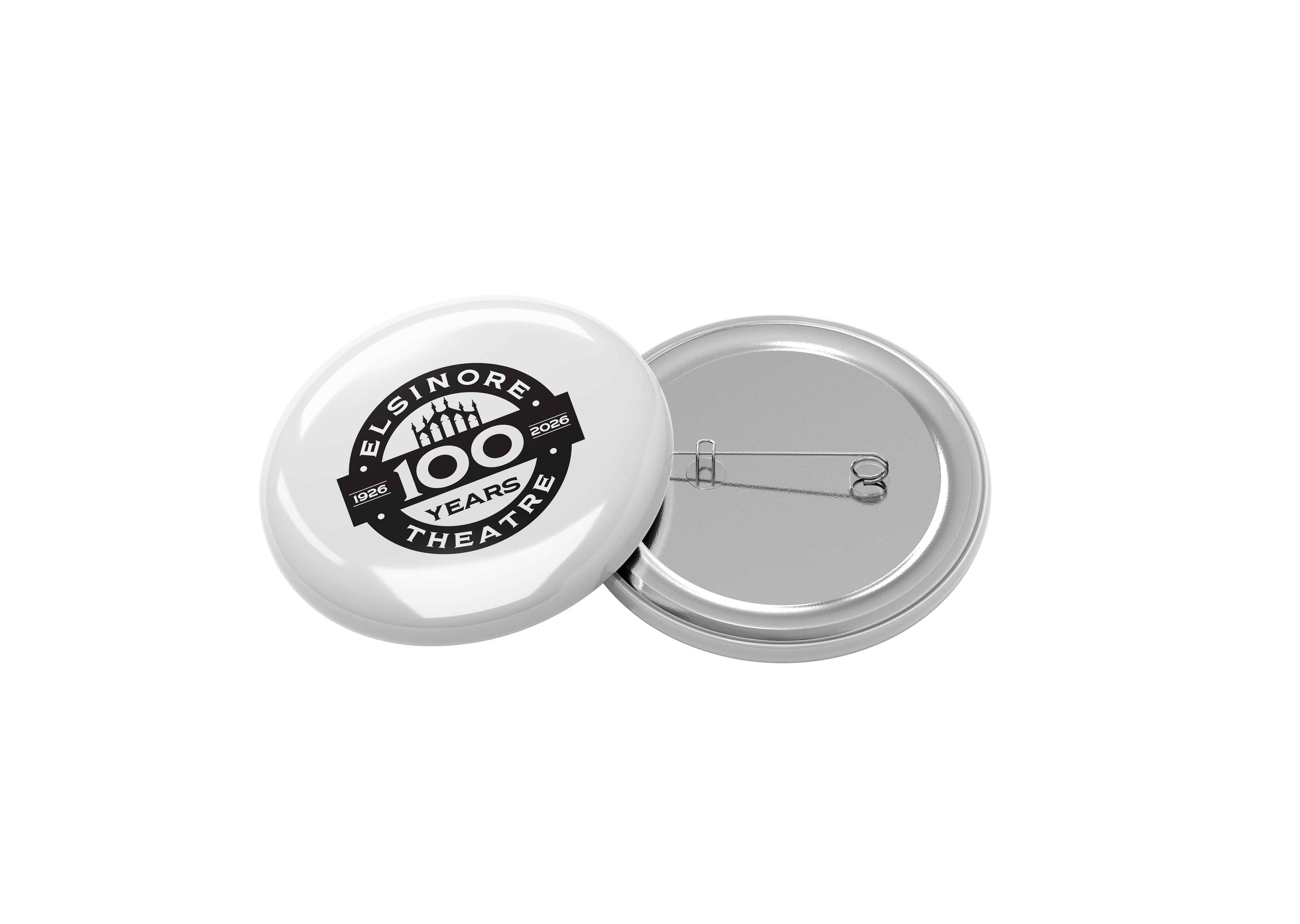
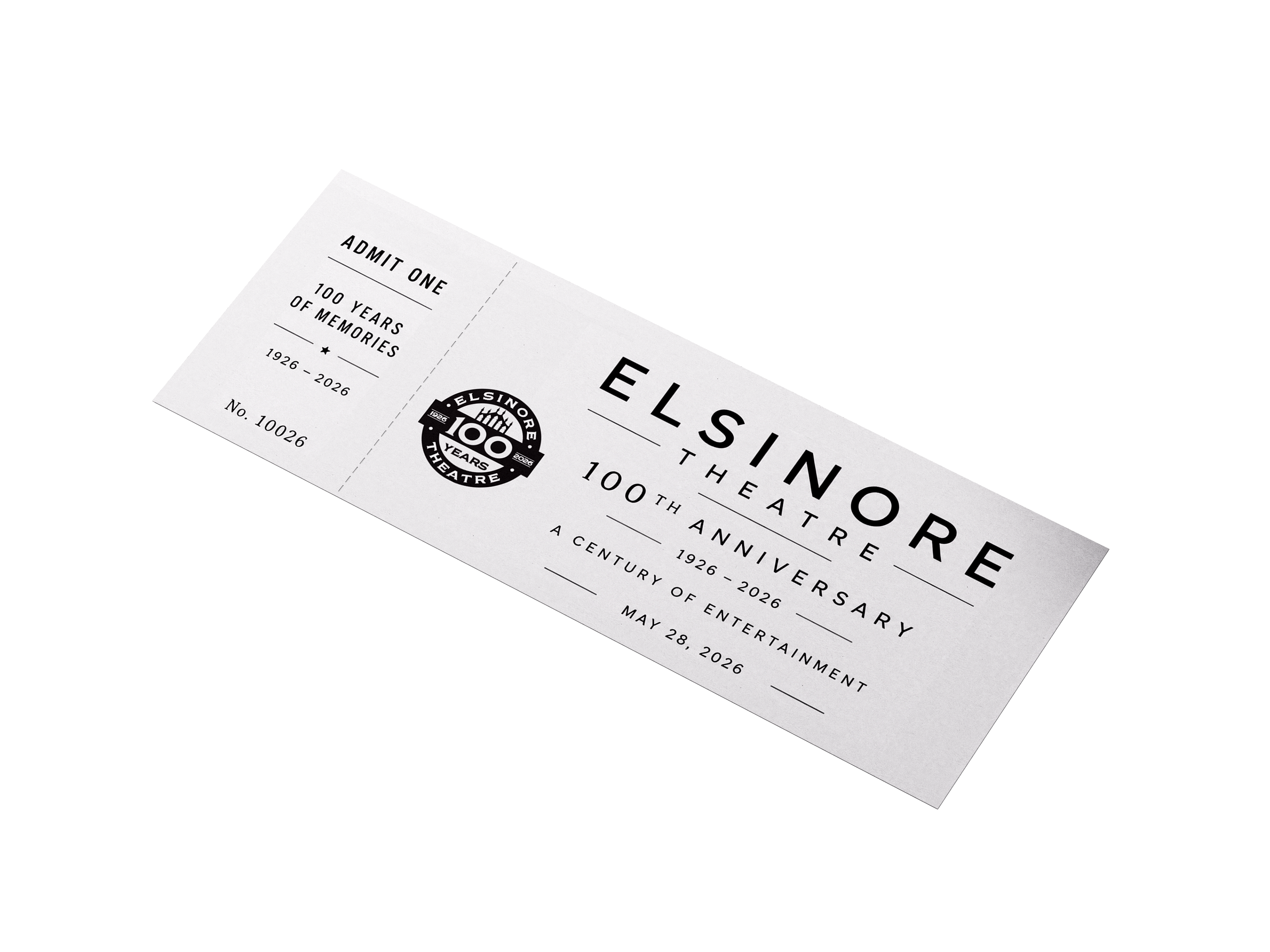
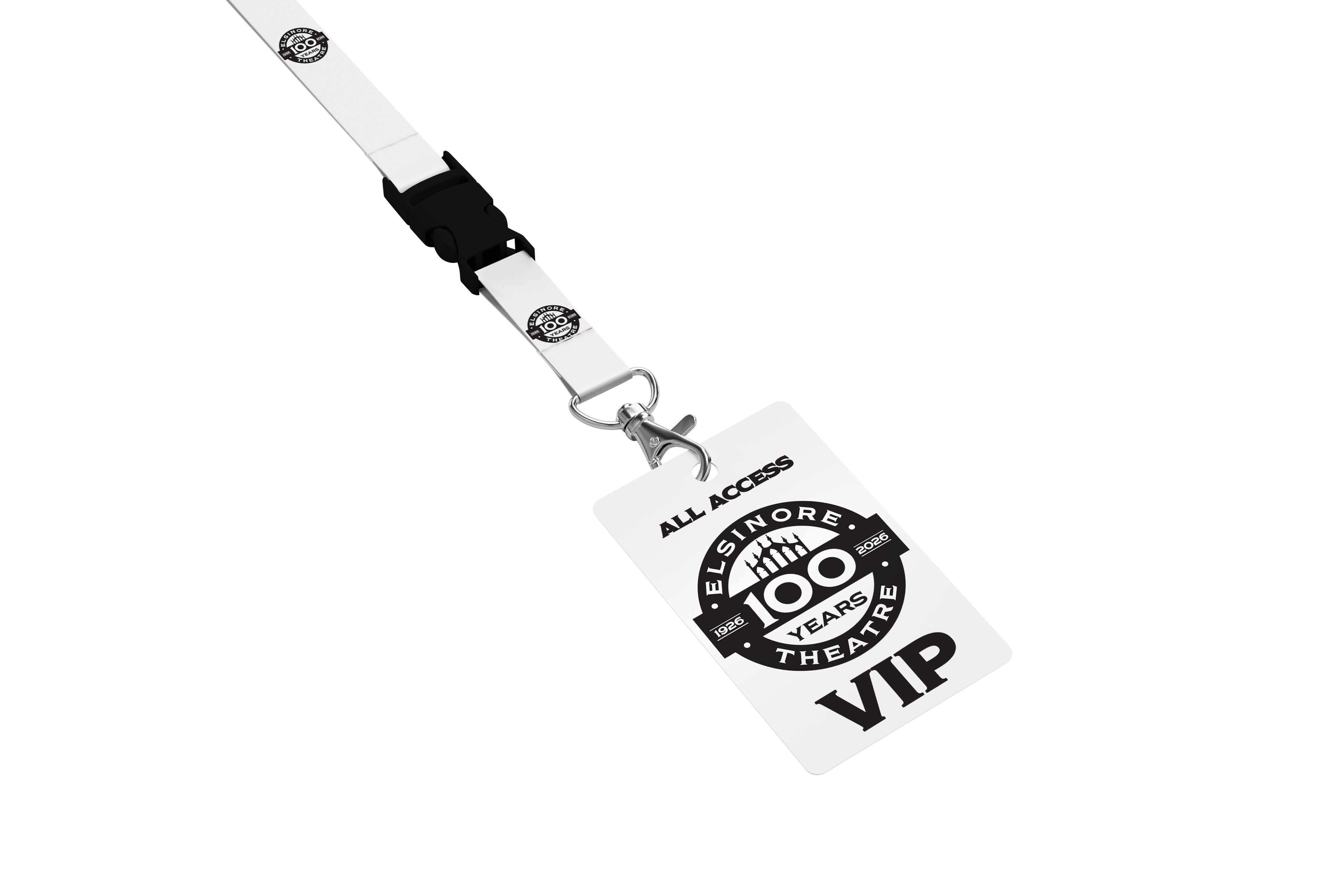

The revised logo builds on feedback by strengthening the connection to the theater’s identity. While the original design emphasized the 100-year milestone, the updated version incorporates the iconic crown from the theater’s architecture, creating a stronger visual link to the building. Reversed colors add boldness and help the anniversary branding stand out while honoring the theater’s unique style and history.